Alchemy Bartending School
Graphic Design
Branding
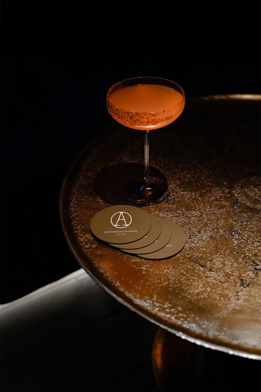
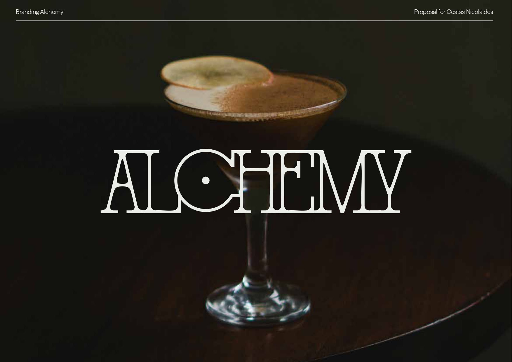
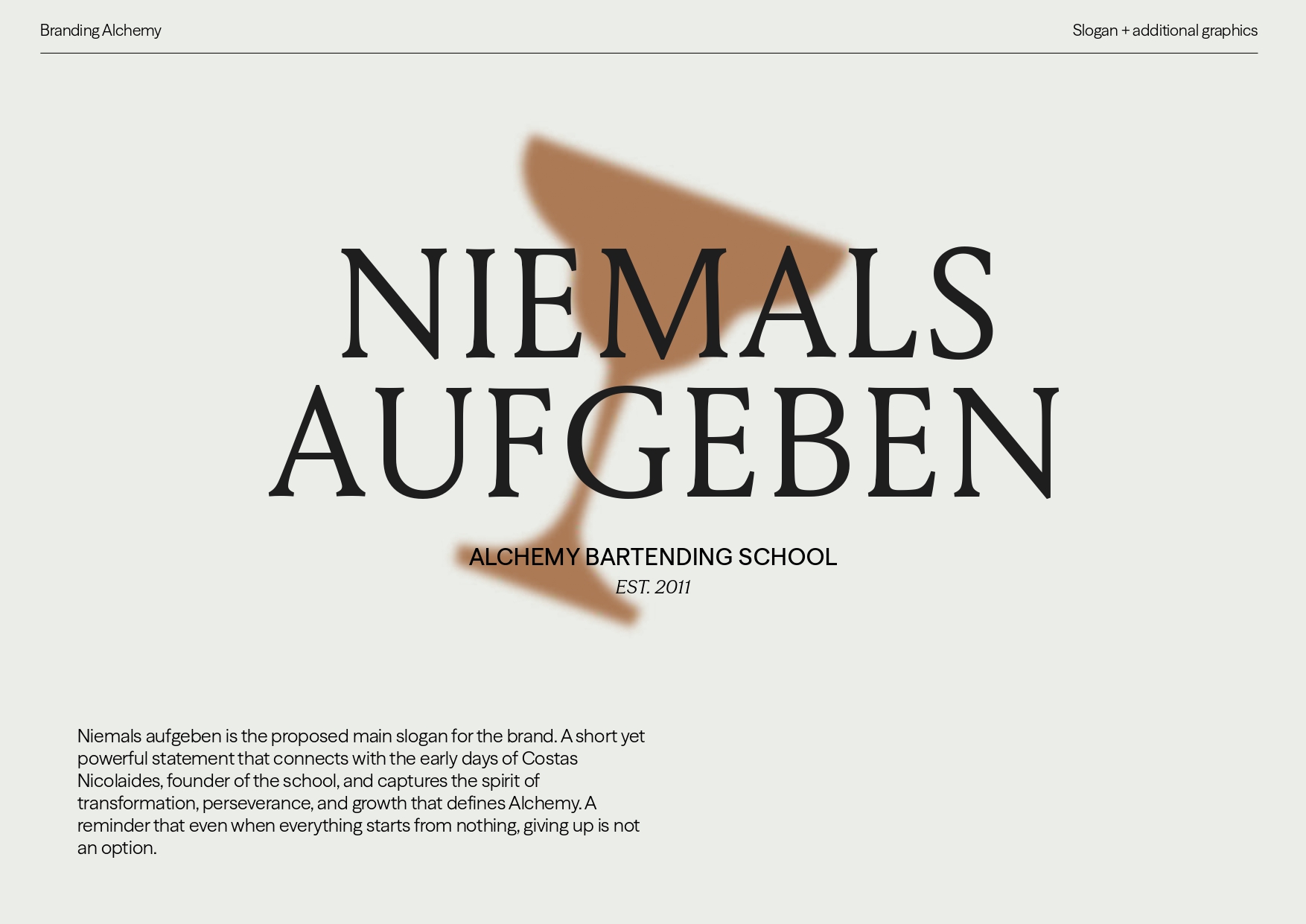
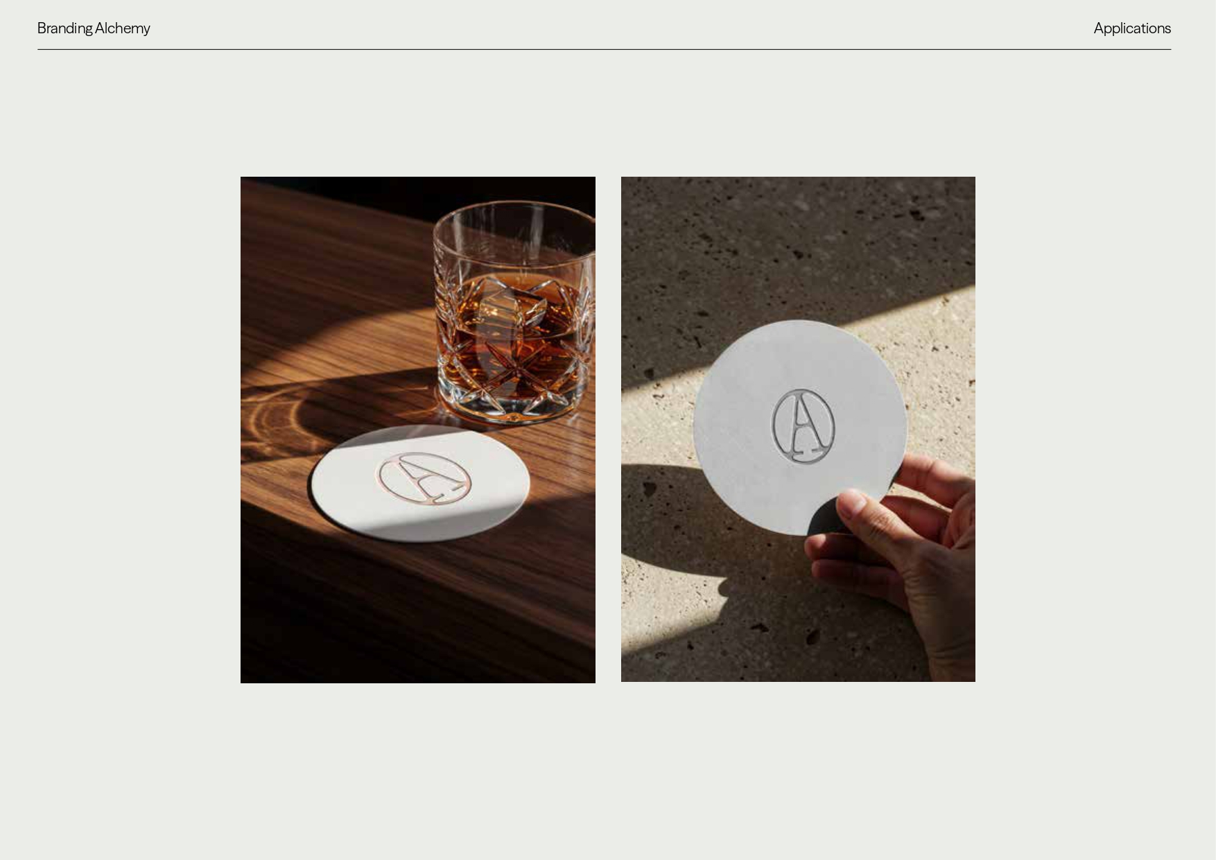
Complete rebranding for Alchemy Bartending School, a bartending school founded in 2011. We developed a visual identity built on the fusion of two universes, featuring a custom logo, icon system, six-color palette, and applications. A brand that doesn't describe what the school does, but what it evokes: transformation.

For over a decade, Alchemy has been transforming people through bartending. However, its visual identity didn't live up to that narrative. The brief was clear: to build a new brand from scratch, capable of conveying everything the school represents with the same conviction.
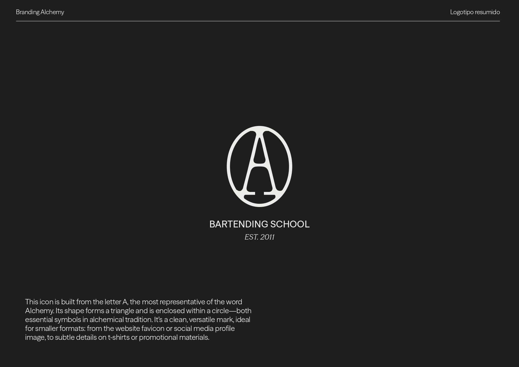
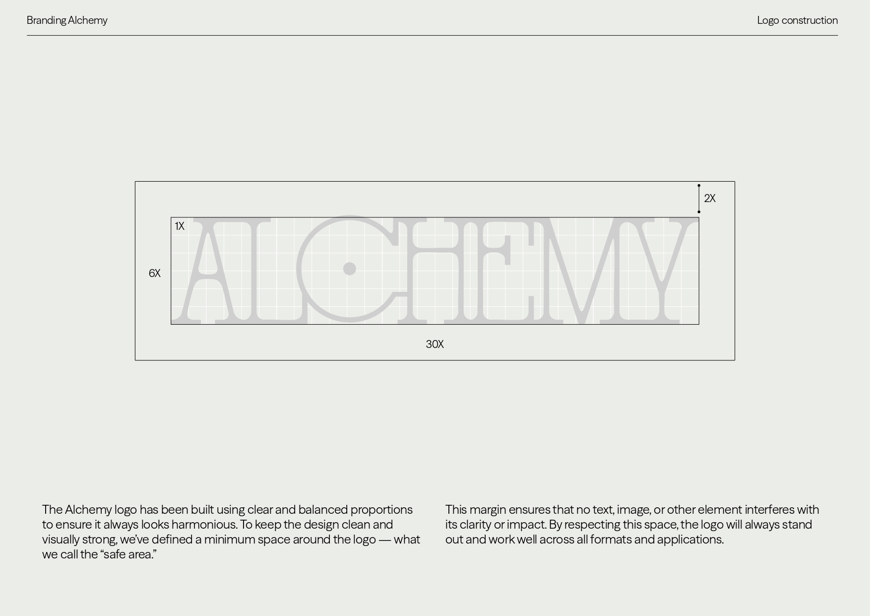
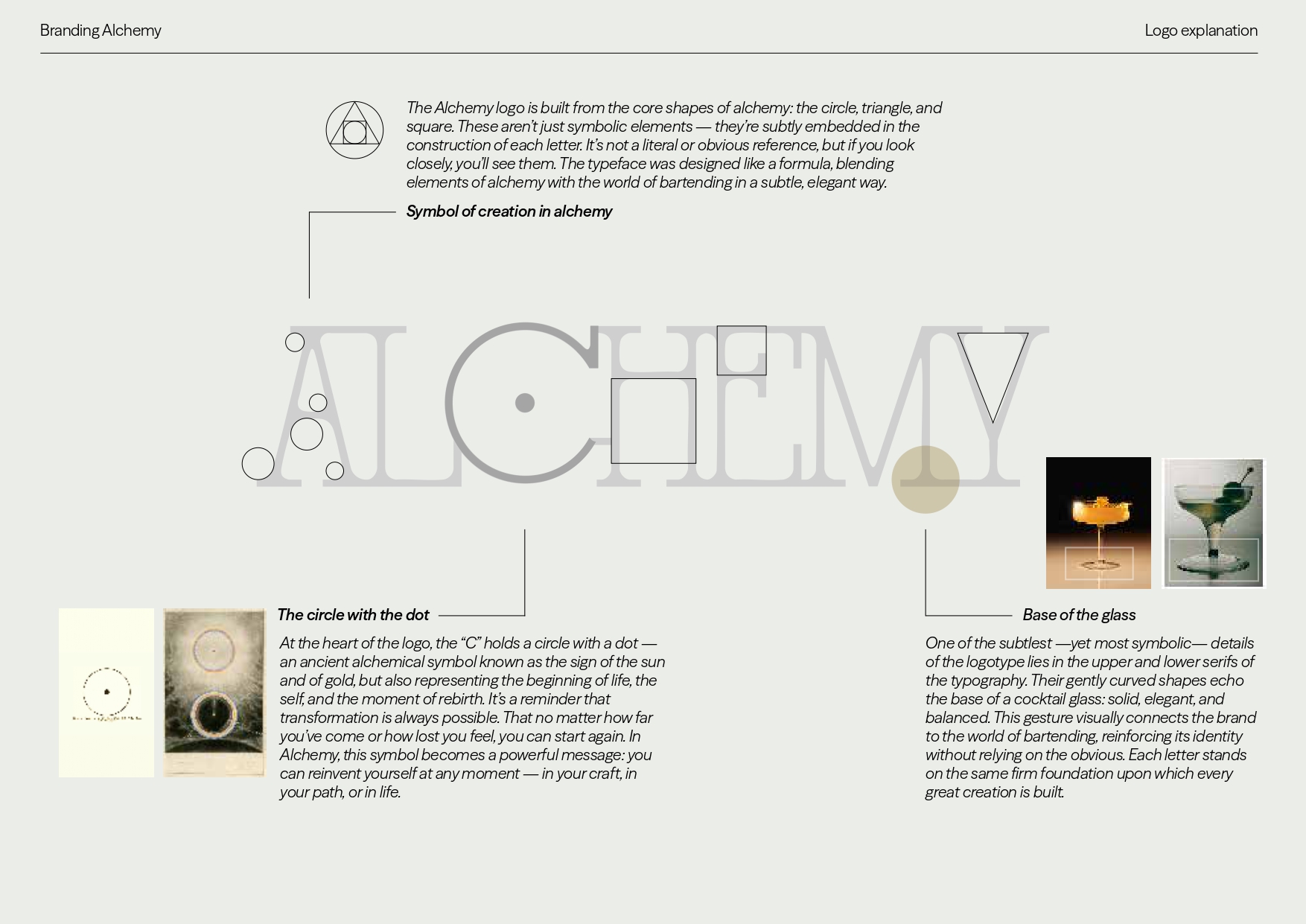
The conceptual starting point was the confluence of two disciplines that share a common obsession with transformation: classical alchemy and contemporary mixology. From there, we developed a complete identity system (logo, icon, typography, palette, and applications) where every design decision has a symbolic and functional basis.
The result is a brand that doesn't illustrate what Alchemy does, but what it means. Precise, full of meaning, and built to last.