David Gómez Piano
Creative Direction,
Graphic Design
Editorial Design
Working on Portrait's visual identity was an exercise in balance: accompanying the music without imposing anything on it. David Gómez is a pianist with a very strong sensibility, and Portrait is a profoundly personal work. The challenge was to translate that sound universe into a sober, emotional and timeless graphic language. The project was built from a very clear idea: to leave space. Space for silence, for texture, for imperfection. The graphics are based on clean compositions, organic materials and a contained palette, where the image and the paper dialogue without noise.
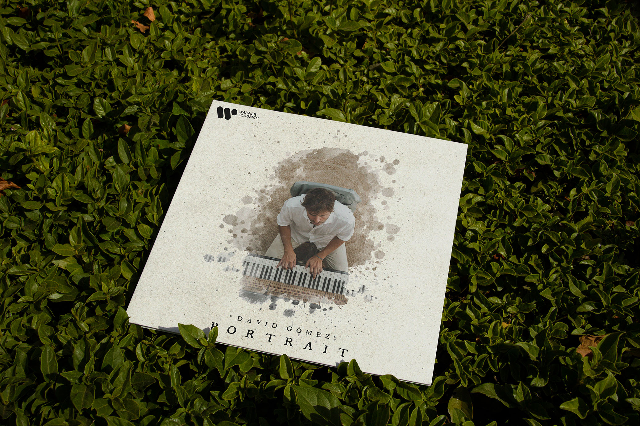
Vinyl of Portrait for Warner Classics
The vinyl design is based on an intimate look at David himself and his relationship with the piano. The central image does not seek the spectacular gesture, but rather the moment of concentration, almost of recollection.
The graphic intervention (stains, glazes, texture) works as an emotional extension of the music.
Special attention was paid to the visual rhythm, the balance between photography and emptiness, and the feeling of a physical object. An album designed to be played, not just to be listened to.
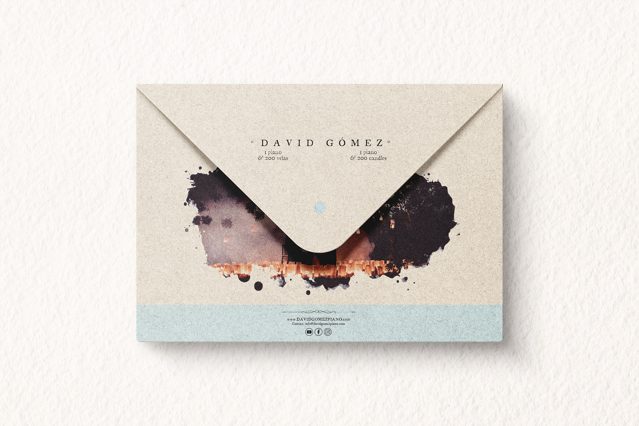
Corporate envelope to send to City Councils
The envelope is conceived as just another piece of the visual universe of the project, not as a simple functional support.
The illustration and graphic treatment envelop the content in a subtle way, creating a delicate first impression consistent with the tone of the album.
The choice of colors, textures and composition reinforces this idea of a careful, almost ceremonial presentation.
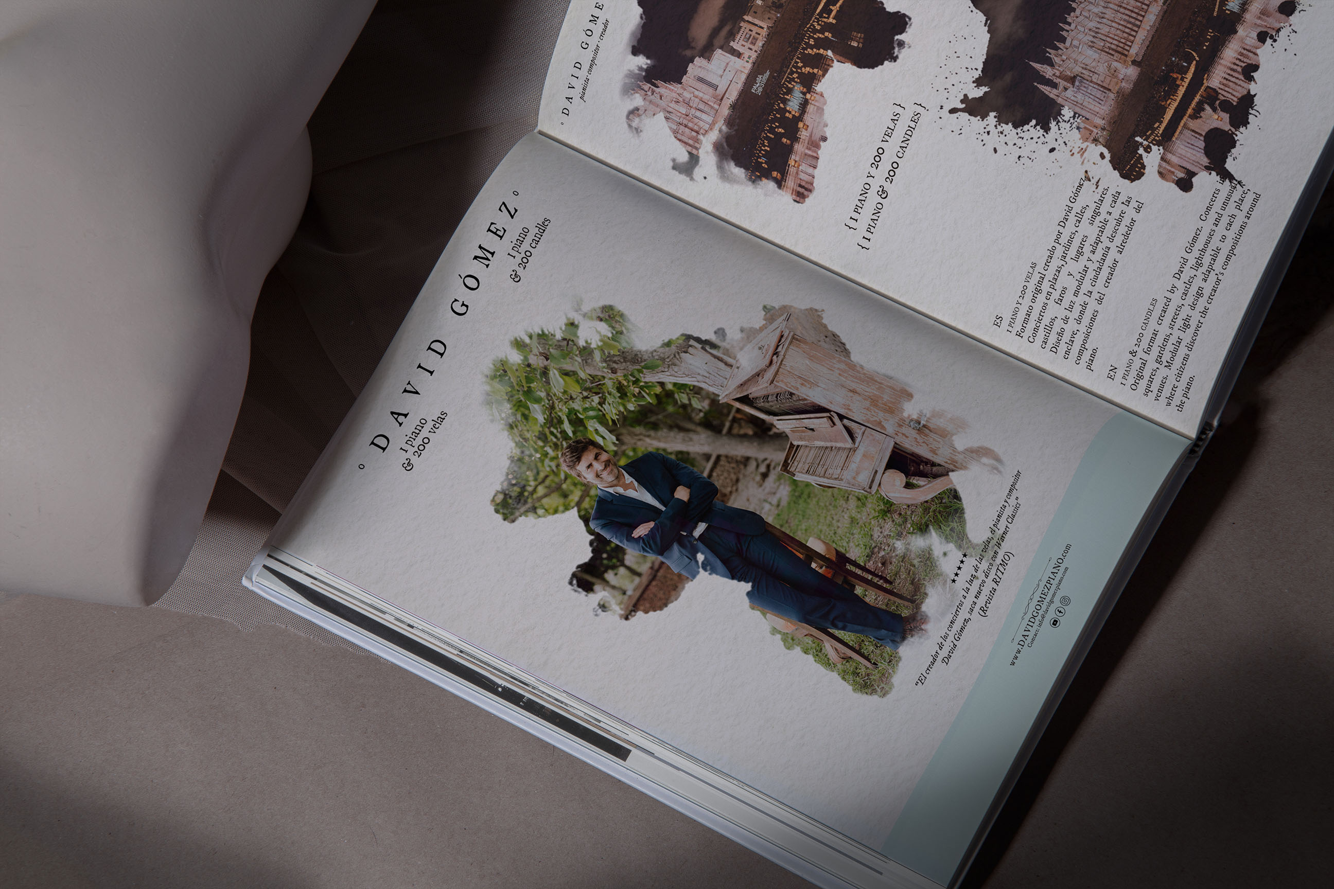
Catalogue/Dossier
The catalog works like a visual story. Through photography, text and white space, a narrative is constructed that explains who David Gómez is and what is behind Portrait and of his very personal projects.
The layout is deliberately slow, letting each element breathe and respecting the times, as does the music.
Typography, hierarchies and composition were worked with a clear editorial logic, seeking a fluid reading and a serene experience.
Focus
This project was not intended as a typical promotional identity, but rather as an honest visual accompaniment to a very personal musical work.